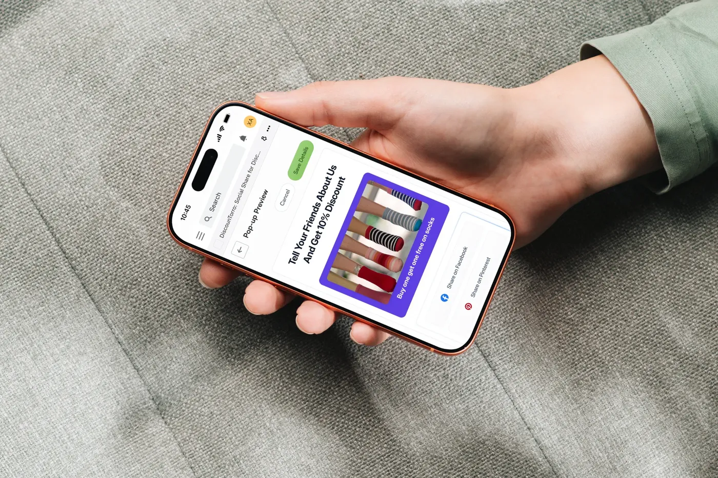
Sosharely helps small Shopify stores get seen without paying for ads, by turning shoppers into the channel: share a store-approved post, get a discount code. I designed the merchant setup, the dashboard and the shopper-facing pop-up in five weeks, inside Shopify's own design conventions.


 Search


 Share on Facebook
 Share on Pinterest
 Share on Twitter

A frictionless moment to share.
Store owners want more reach, and their happiest customers are already willing to post. What's missing is a frictionless moment, at checkout or on the product page, where sharing is easy and clearly rewarded.
Merchants
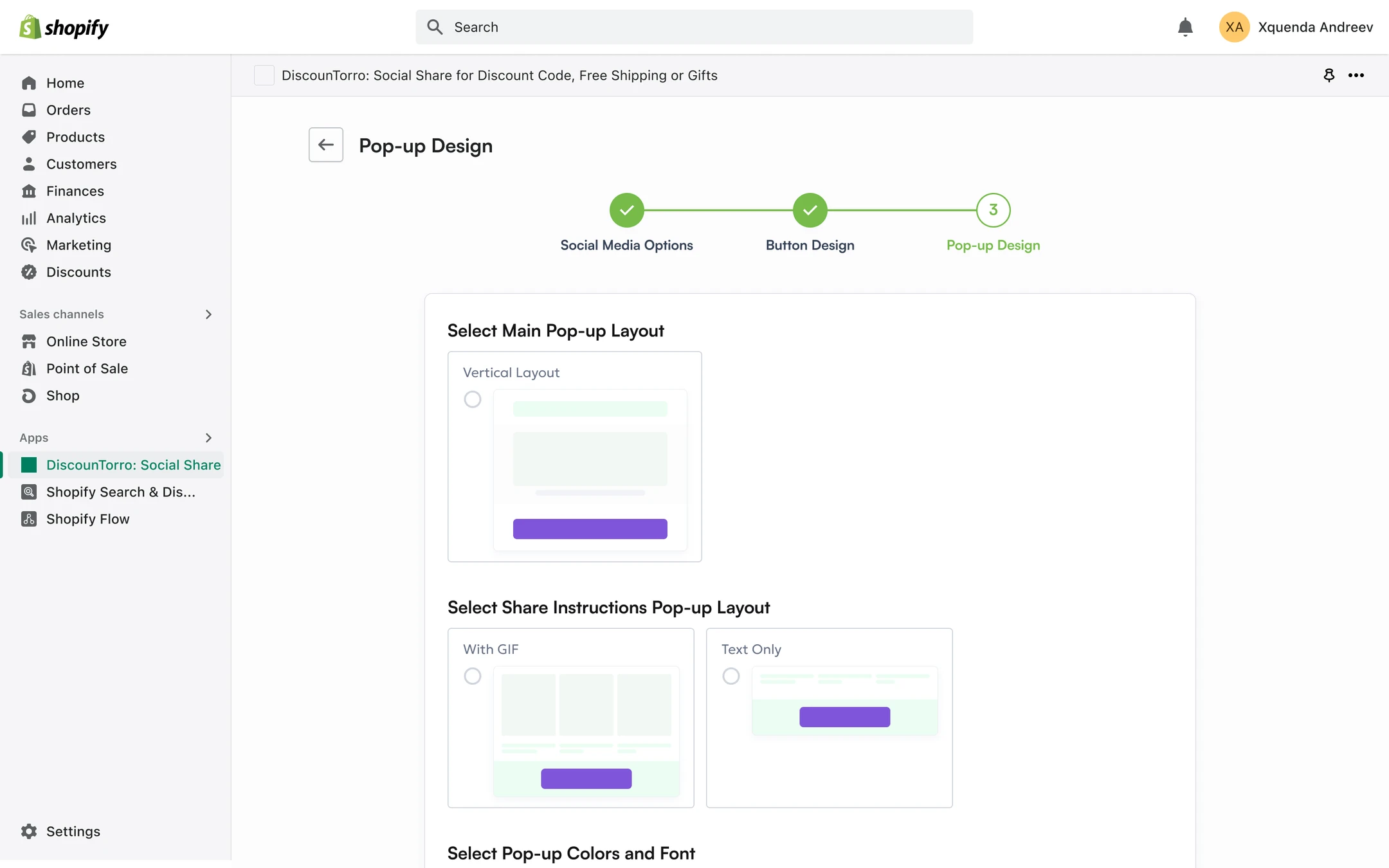
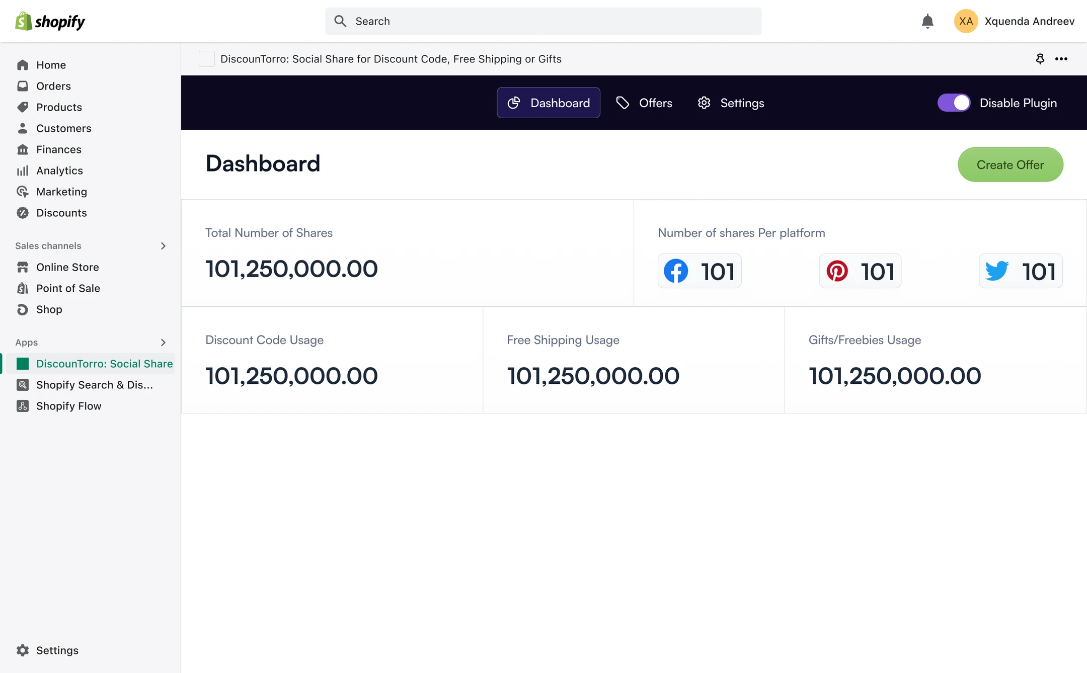
Set up once, in minutes, and see what sharing earned them: shares, and orders using the generated codes.
Shoppers
Understand the offer and share correctly the first time.
Platform fit
Feel native to Shopify.
- 01
Shopify's Polaris design system.
Polaris components kept the admin familiar to merchants and quick to build.
- 02
Two very different surfaces.
A merchant admin in Polaris, and a shopper pop-up that had to match each store's branding, so button and pop-up styles are customisable.
- 03
Mobile first.
Everything had to work on mobile, where most social sharing happens.
- 04
Research before pixels.
I set up a demo store and studied Shopify's app docs and competing apps before designing.
“When I launch a promotion, I want customers to spread it for me, without designing anything.”
“When I see a discount for sharing, I want to know exactly what to post and how, so I actually get the code.”
Five versions of one pop-up.
The pop-up had to get two messages across: the offer, and what the shopper would be sharing to earn it. It was the hardest part of the project, and it took five versions to get the hierarchy between those two messages right.
- 01
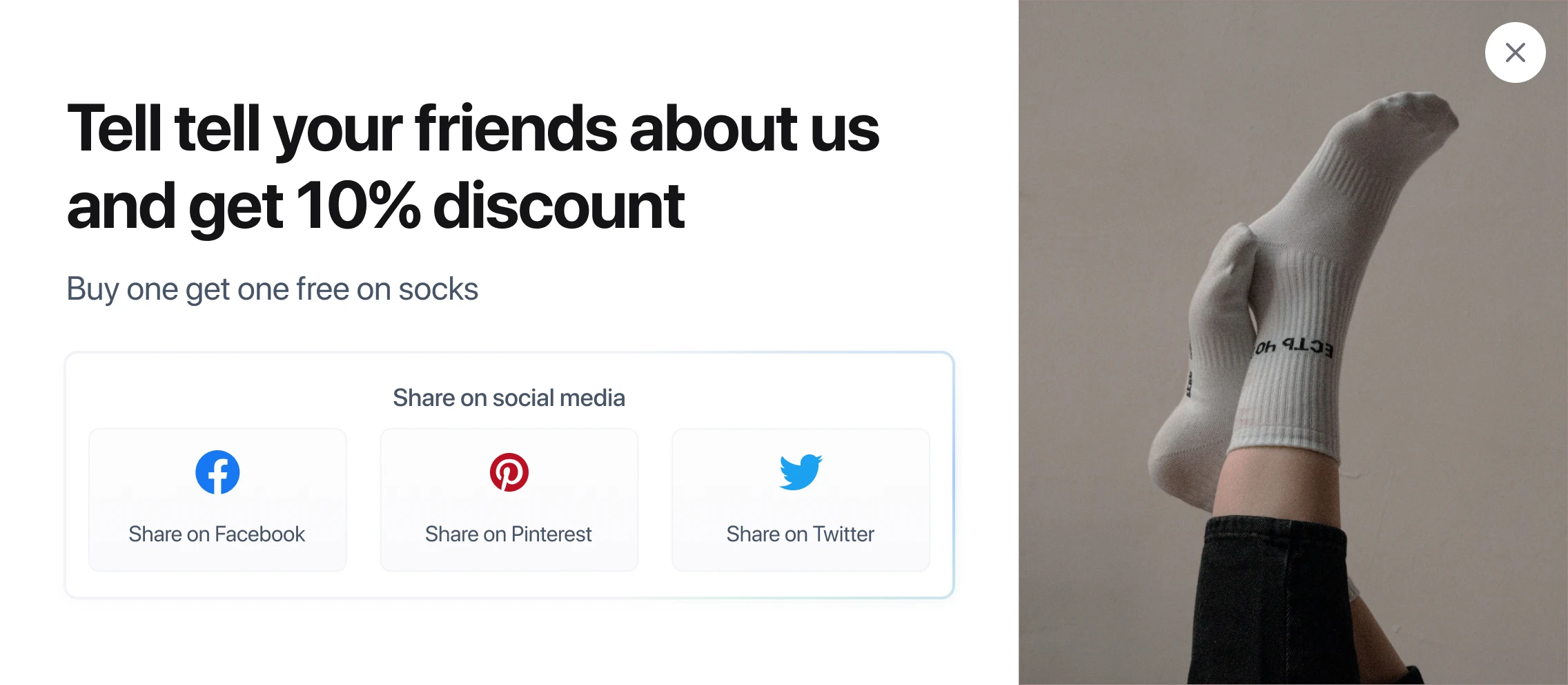
Offer beside a photo.
The offer and share buttons on one side, the product on the other. Nothing set the two messages apart.
- 02
Smaller and more compact.
The photo moved above the offer. Tidier, but the hierarchy was still missing.
- 03
The two messages, separated.
The offer became the heading, and the post to be shared got its own panel with its own line. The right idea, still rough.
- 04
A clearer split.
Stronger bands made the separation clearer, but it could look better.
- 05
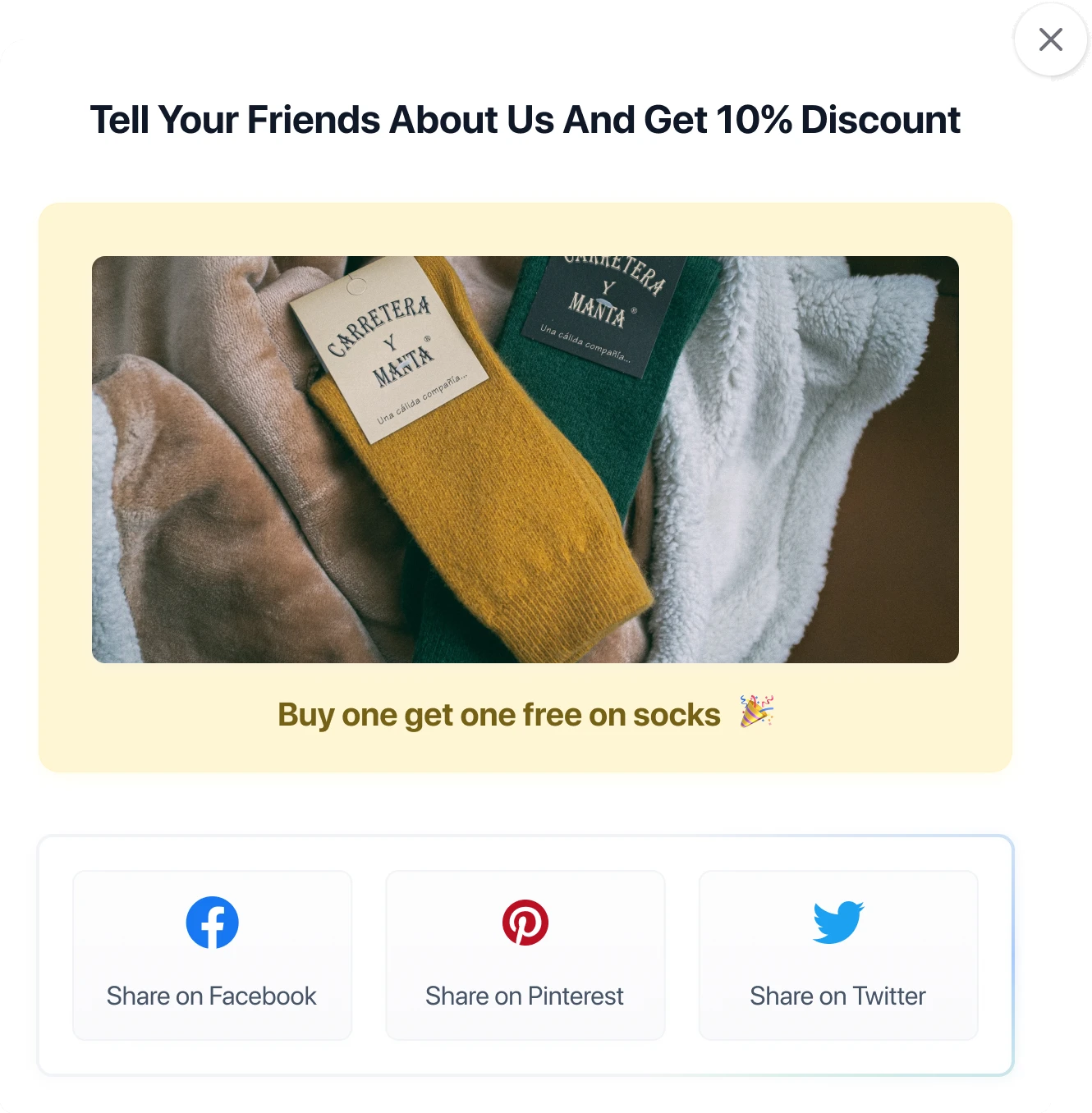
Shipped: the post as its own card.
The post to be shared sits in a soft yellow card with its offer underneath, between the heading and the share buttons. The visuals finally carried the hierarchy.



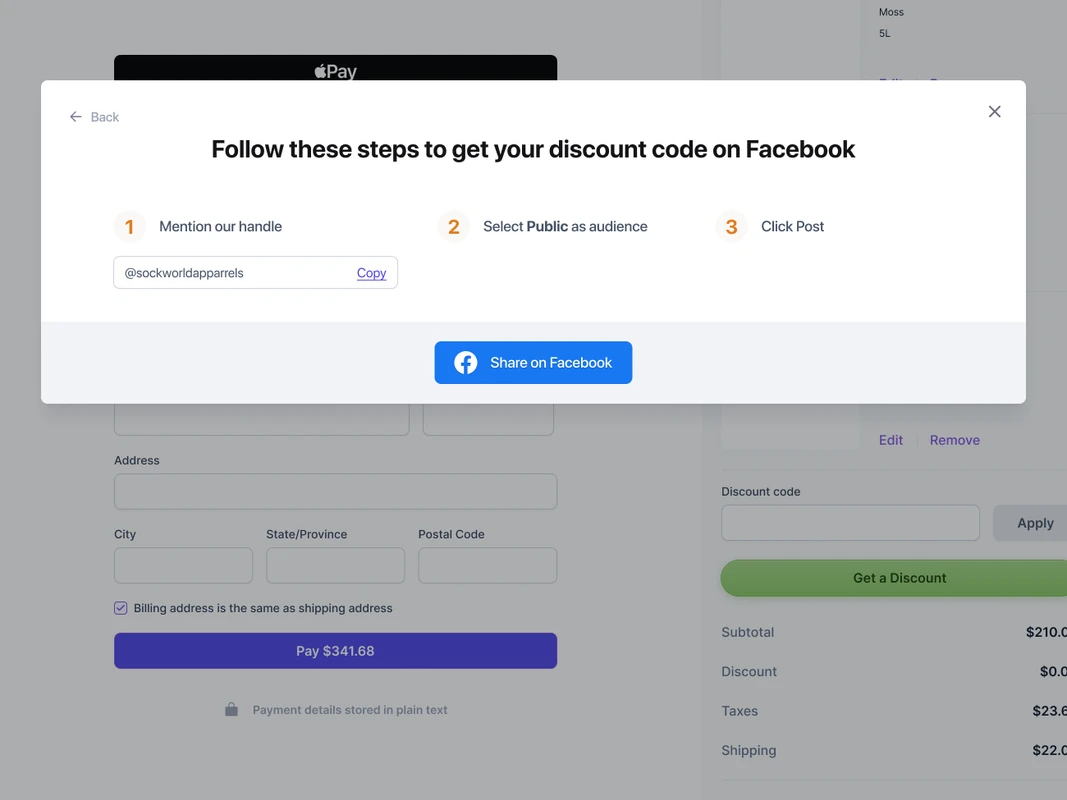
Showing how to share, step by step.
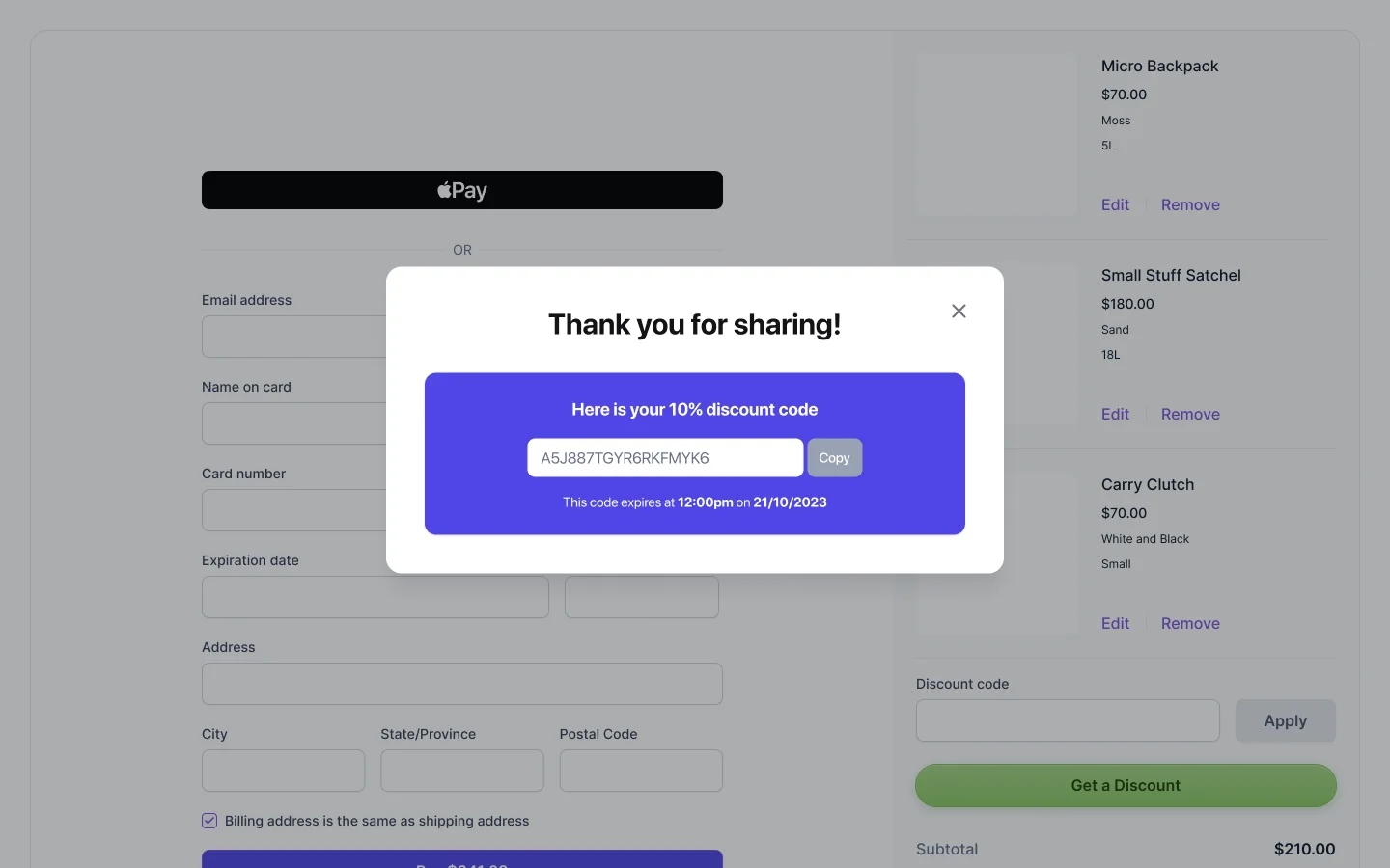
Shoppers only get the code if they share correctly. So after choosing a platform, a second pop-up shows how: the steps in order, each with a short line of text, and the store's handle ready to copy.
Merchant admin
- Onboarding in sections: socials, button design, pop-up design
- Dashboard: shares, and orders with generated codes
- Create and edit a promotion in one modal
- Settings: re-customise, manage subscription, preview the pop-up
Shopper storefront
- Discount button
- Main share pop-up
- “How to share” guide
- Mobile-responsive throughout
- 01
Reach versus what feels natural.
Social commerce means balancing the business goal against what feels natural to a shopper: sharing shouldn't feel like a chore for a coupon.