TimeSwapr is a time bank: an hour you give earns an hour you can receive. I designed it end to end, from a survey and competitive audit to a Maze usability test that reshaped the app's most important screen.
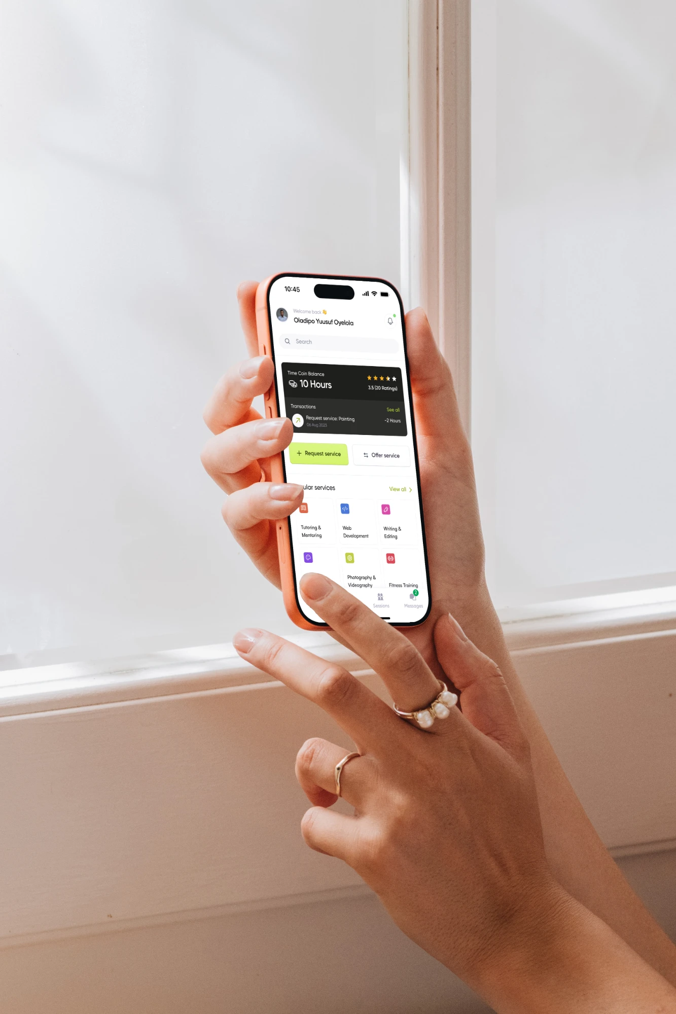
Helping each other, without money changing hands.
People want to give back but lack the time, connections and resources, and many people with real needs can't pay for help. My survey backed this up: respondents listed what they could offer (tutoring, tech help, mentoring, childcare) and why they'd take part (personal growth, relationships, reciprocity).
The goal was a simple app where an hour you give earns an hour you can receive, usable by everyone from people in their early 20s to people in their 60s and beyond. Usability testing in Maze showed people couldn't tell an offer from a request, and restructuring that one screen became the key decision of the project.
A time bank that feels like a modern marketplace app.
Time banking already exists, in Timebanking UK, Time Republik, Time Auction and Simbi. The opportunity was to make it feel like the apps people already use: browse, book, meet, rate.
Three things had to be true.
Easy first exchange
Sign up, pick skills and interests, and book or offer a service in a few steps.
Strangers feel safe
ID verification, a security code for in-person meetups, and mandatory mutual ratings.
People come back
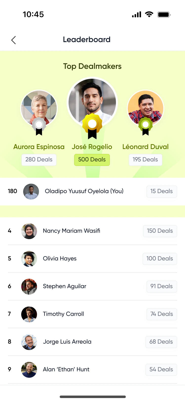
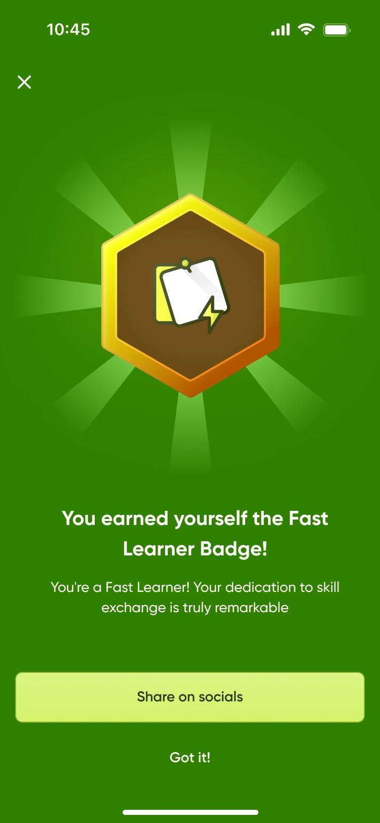
A TimeCoin balance, leaderboards and badges, used sparingly.
- 01
Trust without money.
With no payment to dispute, trust had to come from identity, ratings and meetup security.
- 02
A wide age range.
From the 20s to 60s and beyond, so the interface had to stay plain and readable.
- 03
A two-role model.
The same person can be a Contributor, who offers, and a Requester, who requests, so labels and flows had to make the role obvious.
“When I need a hand with something I can't pay for, I want to find someone nearby who can help, and give my own time back later.”
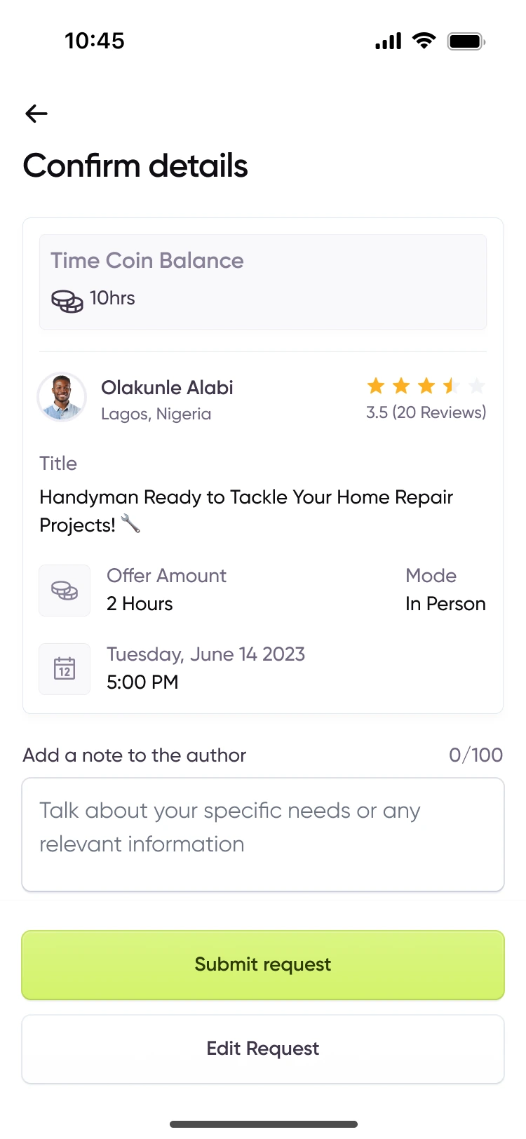
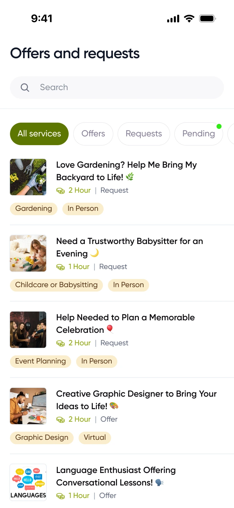
Offers and requests looked the same.
In the tested version, offers and requests were mixed on one page, alongside an All Services tab, and their cards looked alike. The Maze test showed two things: people couldn't tell which card was an offer and which was a request, and having both on the same page confused them.
Split by intent, then by status.
I removed All Services and separated the tabs by what the person is doing, offering or requesting, then by where the exchange stands: going, pending, past. Category and mode badges (in person or virtual) were harmonised across cards.
- 01
It fixes the exact confusion the test surfaced.
- 02
Each tab answers one question, like “What can I get?” or “What's coming up?”
- 03
It makes the Contributor and Requester roles visible without explaining them.
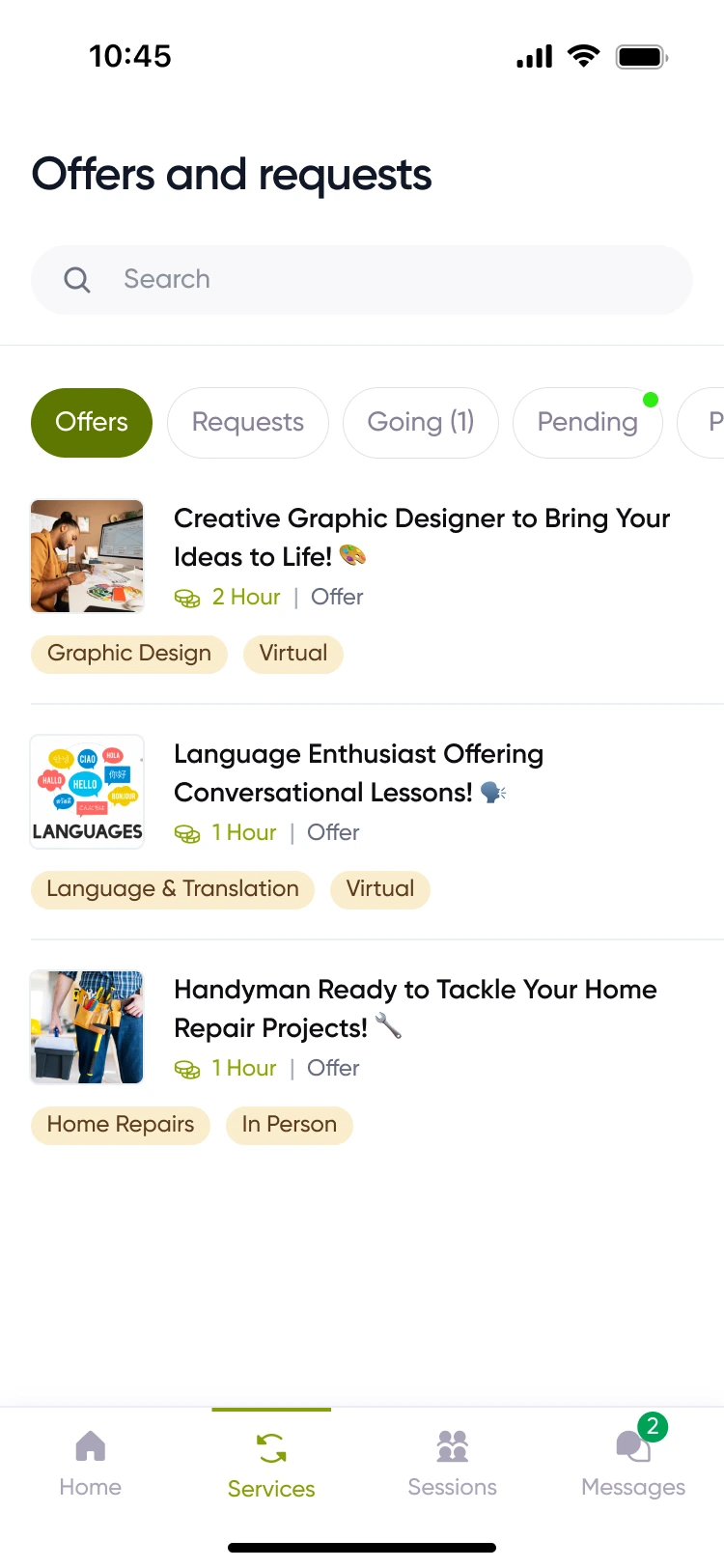
People lose a single “see everything” view, but they always know what they're looking at.
Core, designed and tested
- Onboarding with skill and interest setup
- Home: TimeCoin balance with request and offer actions
- Services: offers, requests, booking and the exchange
- Messaging
- ID verification and the meetup security code
Supporting
- Group sessions
- Leaderboards and badges
- Settings and profile
- 01
Test the model, not just the screens.
The confusion wasn't visual; it was two concepts on one page.
- 02
Trust is a feature set, not a badge.
Verification, meetup codes and ratings work together.
- 03
Words are design.
Working with a UX writer sharpened the labels, Contributor and Requester, and showed me how a writer works through a flow alongside the design.